In my previous post I discussed some of the holidays that lend themselves to engaging email ad campaigns and shared some ideas for effective email ads.
In this post, I cover practices that will enable you to get the most out of your emails and avoid missing a step that could result in problems.
Here’s my “good practices” checklist for email campaigns:
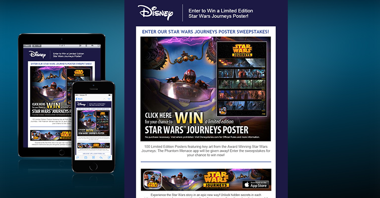
- Email ads will display differently when viewed on various systems and devices because of many variables, so it is vital to thoroughly test your email on a variety of different browsers, email clients, and devices before deployment. Make sure your creative agency includes this service.
- Include legal copy, promo expiration dates, and copyrights in every email.
- Get signoff approvals from all relevant departments, especially legal, once your creative is complete and before programming begins. You can’t recall an email blast once it’s been deployed, so prior approvals are a must.
- Always include an opt-out link for the recipient.
- Add the email addresses of your creative team as seed names on your deployment list. That way, they will see what the recipients see, which is invaluable for them when assessing how the creative and programming render once deployed.
- Include a plain text format of your email ad. Most deployment houses require this in addition to the html format, so your creative team should always include it.
- Always have a at least a small amount of html text. Your email creative can be mainly images, but including at least a small amount of html text will help you get more opens if some of your recipients’ devices are set to have images turned off. Our clients tend to like image-heavy designs, but we also include a little html text while maintaining a beautiful engaging overall design.
- Have your creative agency do the design and programming. This keeps continuity with the email that would be lost by having your agency do the design and someone else do the programming. Your agency can also host the images.
- Make the call-to-action clearly visible and easy to access. The goal of your email is for recipients to take action, so recipients shouldn’t have to hunt around to find your call-to-action. It also should be easy to access on small mobile screens as well as on larger monitors.
- Track the activity of clicks to URLs. That way, you can run A/B testing of offers, creative, subject lines, headlines, animation vs. static images, etc. to learn what will yield the best ROI.

For help with your email marketing campaign contact The Lawnsby Group for more information.
Images: © The Lawnsby Group


Leave A Comment